为什么会有1px的问题
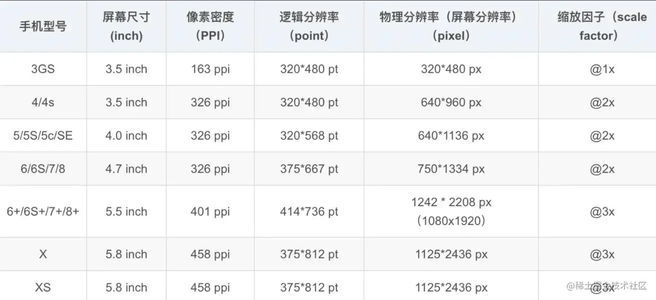
在开发移动端项目时,针对屏幕分辨率为 375*667 的设备,UI 设计师给的设计稿是 750*1334 像素的,对于 UI 来说,这 1px 是相对于 750*1334,而我们写的 1px 的 css 是相对于 375*667 的,所以映射到 750*1334 的设计稿就是 2px
此时我们会发出两个问题:
- 为什么 UI 针对
375*667 的设备设计 750*1334 的图
- 为什么不写
0.5px
为什么要设计 750*1334 的图
先看一张图:
关于设备像素、css 像素、设备独立像素与 dpr 之间的区别,请参考站长文章:
浅谈设备像素、css 像素、设备独立像素、dpr 之间的区别
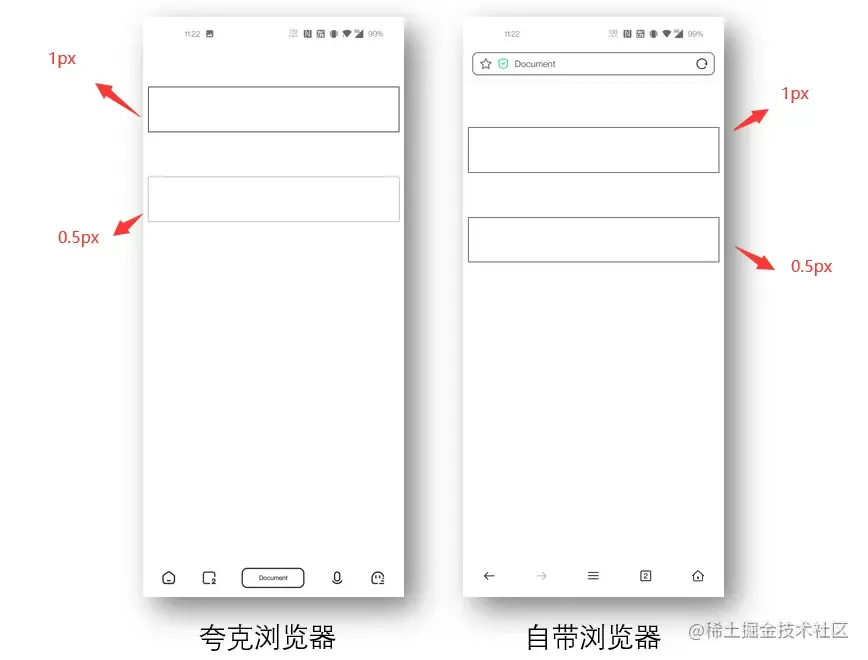
为什么不写 0.5px
其中 Chrome 把 0.5px 四舍五入变成了 1px,而 firefox/safari 能够画出半个像素的边,并且 Chrome 会把小于 0.5px 的当成 0,而 Firefox 会把不小于 0.55px 当成 1px,Safari 是把不小于 0.75px 当成 1px,进一步在手机上观察 iOS 的 Chrome 会画出 0.5px 的边,而安卓(5.0)原生浏览器是不行的。所以直接设置 0.5px 不同浏览器的差异比较大,并且我们看到不同系统的不同浏览器对小数点的 px 有不同的处理。所以如果我们把单位设置成小数的 px 包括宽高等,其实不太可靠,因为不同浏览器表现不一样。如下图所示:
解决方案
1、小数值 px
解决思路
1
2
3
4
5
6
7
8
9
| <body>
<div id="main" style="border: 1px solid #000000;"></div>
</body>
<script type="text/javascript">
if (window.devicePixelRatio && devicePixelRatio >= 2) {
var main = document.getElementById("main");
main.style.border = ".5px solid #000000";
}
</script>
|
优点:简单,好理解
缺点:容性差,目前之余 IOS8+才支持,在 IOS7 及其以下、安卓系统都是显示 0px。
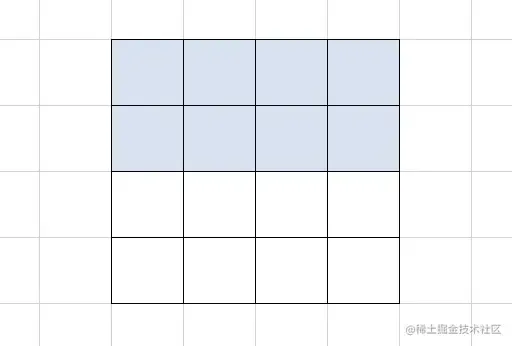
2、通过图片模拟实现 1px
实现原理: 因为 1px 会被渲染为 2px,故我们可以设计一个 2*2px 的图,如果需要设置上边框,则把下面 1px 设置为透明,将上面 1px 设置为我们需要的颜色即可,如下图所示
1
2
3
4
5
6
| @media screen and (-webkit-min-device-pixel-ratio: 2) {
.border {
border-top: 1px solid transparent;
border-image: url(border.png) 2 repeat;
}
}
|
优点:图片可以用gif, png, base64多种格式, 以上是上下左右四条边框的写法, 需要单一边框只要定义单一边框的 border, 代码比较直观
缺点:更换颜色需要更换图片,圆角模糊
3、background-img 渐变
实现原理: 将元素设置为 1px,再通过背景图片渐变裁剪实现
1
2
3
4
5
6
7
8
9
10
11
12
13
| css复制代码.linear-gradient {
position: relative;
}
.linear-gradient::after {
position: absolute;
content: "";
top: 0;
left: 0;
height: 1px;
width: 100%;
background: linear-gradient(180deg, transparent, transparent 50%, #999 50%);
}
|
优点:实现简单,无副作用
缺点:不能设置四边,无法设置圆角
4、CSS3 box-shadow
1
2
3
4
| css复制代码.shadow {
-webkit-box-shadow: 0 1px 1px -1px rgba(255, 0, 0, 0.5);
box-shadow: 0 1px 1px -1px rgba(255, 0, 0, 0.5);
}
|
模拟效果:没觉得这个方法好用,模拟的效果差强人意,颜色也不好配置,不推荐
5、使用 viewport initial-scale
实现原理: 设置整个页面进行缩小,并设置用户不能对页面进行缩放,然后写 1px 页面即可展示 1px 的边框,在devicePixelRatio=2设置 meta
1
2
3
4
| <meta
name="viewport"
content="width=device-eidth, initial-scale=0.5, maximum-scale=0.5, minimum-scale=0.5, user-scalable=no"
/>
|
优点:可以直接写 1px,兼容性好,适合搭配新项目使用
缺点:会让页面缩小,如果是老项目,需要全部的更改 css 样式
原理是把原先元素的 border 去掉,然后利用 :before 或者 :after 重做 border ,并 transform 的 scale 缩小一半,原先的元素相对定位,新做的 border 绝对定位。
单条 border 样式设置:
1
2
3
4
5
6
7
8
9
10
11
12
13
14
15
16
| .scale-1px {
position: relative;
border: none;
}
.scale-1px:after {
content: "";
position: absolute;
bottom: 0;
background: #000;
width: 100%;
height: 1px;
-webkit-transform: scaleY(0.5);
transform: scaleY(0.5);
-webkit-transform-origin: 0 0;
transform-origin: 0 0;
}
|
四条 border 样式设置:
1
2
3
4
5
6
7
8
9
10
11
12
13
14
15
16
17
18
19
20
| .scale-1px {
position: relative;
margin-bottom: 20px;
border: none;
}
.scale-1px:after {
content: "";
position: absolute;
top: 0;
left: 0;
border: 1px solid #000;
-webkit-box-sizing: border-box;
box-sizing: border-box;
width: 200%;
height: 200%;
-webkit-transform: scale(0.5);
transform: scale(0.5);
-webkit-transform-origin: left top;
transform-origin: left top;
}
|
结合 js 来代码来判断是否是 Retina 屏
1
2
3
| if (window.devicePixelRatio && devicePixelRatio >= 2) {
document.querySelector("div").className = "scale-1px";
}
|
优点:
缺点:
7、通过 svg 实现
实现原理: 因为 svg 是矢量图形,它的 1px 对应的物理像素就是 1px
可以搭配 PostCSS 的 postcss-write-svg 使用:
1
2
3
4
5
6
7
8
9
10
11
12
| @svg border_1px {
height: 2px;
@rect {
fill: var(--color, black);
width: 100%;
height: 50%;
}
}
.svg {
border: 1px solid transparent;
border-image: svg(border_1px param(--color #00b1ff)) 2 2 stretch;
}
|
编译后:
1
2
3
4
5
| .svg {
border: 1px solid transparent;
border-image: url("data:image/svg+xml;charset=utf-8,%3Csvg xmlns='http://www.w3.org/2000/svg' height='2px'%3E%3Crect fill='%2300b1ff' width='100%25' height='50%25'/%3E%3C/svg%3E")
2 2 stretch;
}
|
优点:实现简单,可以实现圆角,
缺点:需要学习 svg 语法
开源库的解决方案
一些开源库也有自己对于 1px 的解决方案
vant
使用less写的
1
2
3
4
5
6
7
8
9
10
11
12
13
14
15
16
17
| .hairline-common() {
position: absolute;
box-sizing: border-box;
content: " ";
pointer-events: none;
}
.hairline(@color: @border-color) {
.hairline-common();
top: -50%;
right: -50%;
bottom: -50%;
left: -50%;
border: 0 solid @color;
transform: scale(0.5);
}
|
ant-design-mobile
1
2
3
4
5
6
7
8
9
10
11
12
13
14
15
16
17
18
19
20
21
22
23
24
25
26
27
28
29
30
31
32
33
34
35
36
37
38
39
40
41
42
43
44
45
46
47
48
49
50
51
52
53
54
55
56
57
58
59
60
61
62
63
64
65
66
67
68
69
70
71
72
73
74
75
76
77
78
79
80
81
82
83
84
85
86
87
88
89
90
91
92
93
94
95
96
97
98
99
100
101
102
103
104
105
106
107
108
109
110
111
112
113
114
115
116
117
118
119
120
121
122
123
124
125
126
127
128
129
130
131
132
| .scale-hairline-common(@color, @top, @right, @bottom, @left) {
content: "";
position: absolute;
background-color: @color;
display: block;
z-index: 1;
top: @top;
right: @right;
bottom: @bottom;
left: @left;
}
.hairline(@direction, @color: @border-color-base) when (@direction = "top") {
border-top: 1px solid @color;
html:not([data-scale]) & {
@media (min-resolution: 2dppx) {
border-top: none;
&::before {
.scale-hairline-common(@color, 0, auto, auto, 0);
width: 100%;
height: 1px;
transform-origin: 50% 50%;
transform: scaleY(0.5);
@media (min-resolution: 3dppx) {
transform: scaleY(0.33);
}
}
}
}
}
.hairline(@direction, @color: @border-color-base) when (@direction = "right") {
border-right: 1px solid @color;
html:not([data-scale]) & {
@media (min-resolution: 2dppx) {
border-right: none;
&::after {
.scale-hairline-common(@color, 0, 0, auto, auto);
width: 1px;
height: 100%;
background: @color;
transform-origin: 100% 50%;
transform: scaleX(0.5);
@media (min-resolution: 3dppx) {
transform: scaleX(0.33);
}
}
}
}
}
.hairline(@direction, @color: @border-color-base) when (@direction = "bottom") {
border-bottom: 1px solid @color;
html:not([data-scale]) & {
@media (min-resolution: 2dppx) {
border-bottom: none;
&::after {
.scale-hairline-common(@color, auto, auto, 0, 0);
width: 100%;
height: 1px;
transform-origin: 50% 100%;
transform: scaleY(0.5);
@media (min-resolution: 3dppx) {
transform: scaleY(0.33);
}
}
}
}
}
.hairline(@direction, @color: @border-color-base) when (@direction = "left") {
border-left: 1px solid @color;
html:not([data-scale]) & {
@media (min-resolution: 2dppx) {
border-left: none;
&::before {
.scale-hairline-common(@color, 0, auto, auto, 0);
width: 1px;
height: 100%;
transform-origin: 100% 50%;
transform: scaleX(0.5);
@media (min-resolution: 3dppx) {
transform: scaleX(0.33);
}
}
}
}
}
.hairline(@direction, @color: @border-color-base, @radius: 0)
when
(@direction = "all") {
border: 1px solid @color;
border-radius: @radius;
html:not([data-scale]) & {
@media (min-resolution: 2dppx) {
position: relative;
border: none;
&::before {
content: "";
position: absolute;
left: 0;
top: 0;
width: 200%;
height: 200%;
border: 1px solid @color;
border-radius: @radius * 2;
transform-origin: 0 0;
transform: scale(0.5);
box-sizing: border-box;
pointer-events: none;
}
}
}
}
|
这个值得研究下,比 vant 和 第一种解决方案有点不同,主要在于处理了 DPR 为 2 和为 3 的两种情况,相比来说更加完善。
这里 PX 大写,为了防止插件将 px 转成 rem 等单位
最后,粘一份原生hairline
对应参考:用 JavaScript 创建一个灵活且响应迅速的网页设计 (其中 46 行代码对应的hairline)
1
2
3
4
5
6
7
8
9
10
11
12
13
14
15
16
17
18
19
20
21
22
23
24
25
26
27
28
29
30
31
32
33
34
35
36
37
38
39
40
41
42
43
44
45
46
47
48
49
50
51
52
53
54
55
56
57
58
59
60
61
62
63
64
65
66
67
68
69
70
71
72
73
74
75
76
77
78
79
80
81
82
83
84
85
86
87
88
89
90
91
92
93
94
95
96
| <!DOCTYPE html>
<html lang="en">
<head>
<meta charset="UTF-8" />
<meta name="viewport" content="width=device-width, initial-scale=1.0" />
<title>Document</title>
<style>
.demo {
margin: 200px auto;
height: 200px;
width: 200px;
background: #fff;
text-align: center;
line-height: 200px;
background: #eee;
}
.origin {
border: 1px solid blue;
}
.hairline,
.hairline-top,
.hairline-right,
.hairline-bottom,
.hairline-left {
position: relative;
}
.hairline::after {
content: " ";
transform: scale(0.5);
position: absolute;
box-sizing: border-box;
left: -50%;
right: -50%;
top: -50%;
bottom: -50%;
border: 1px solid blue;
}
.hairline-top::after {
content: " ";
position: absolute;
transform: scaleY(0.5);
box-sizing: border-box;
top: 0;
right: 0;
left: 0;
border-top: 1px solid blue;
}
.hairline-right::after {
content: " ";
position: absolute;
transform: scaleX(0.5);
box-sizing: border-box;
top: 0;
bottom: 0;
right: 0;
border-right: 1px solid blue;
}
.hairline-bottom::after {
content: " ";
position: absolute;
transform: scaleY(0.5);
box-sizing: border-box;
bottom: 0;
right: 0;
left: 0;
border-bottom: 1px solid blue;
}
.hairline-left::after {
content: " ";
position: absolute;
transform: scaleX(0.5);
box-sizing: border-box;
bottom: 0;
top: 0;
left: 0;
border-left: 1px solid blue;
}
</style>
</head>
<body>
<div class="demo origin">normal 1px</div>
<div class="demo hairline">hairline</div>
<div class="demo hairline-top">top hairline</div>
<div class="demo hairline-right">right hairline</div>
<div class="demo hairline-bottom">bottom hairline</div>
<div class="demo hairline-left">left hairline</div>
</body>
</html>
|
更多详情参考:
使用 Flexible 实现手淘 H5 页面的终端适配
本文参考:
吃透移动端 1px (hairline) - 知乎 (zhihu.com)
移动端 1px 像素问题及解决办法 - 掘金 (juejin.cn)
娓娓道来为什么移动端会有 1px 问题以及解决方案(附 demo) - 掘金 (juejin.cn)